By JaySeptember 2026
We Ran Our Own Site Through a Stranger's Checklist
A post went around recently with a simple, sharp premise: "Your vibe coded website looks finished, But It's not." Twenty items followed, spanning technical, SEO, UX, legal, and performance basics. The closing line is the whole pitch: "Pretty is easy. This list is what actually ships." It's picked up over 260,000 views at the time we're writing this, and it's easy to see why: it's aimed squarely at the gap between a site that looks done and a site that actually is.
That gap matters just as much when the reader is a crawler or an agent, not only a person, which is part of why we hold our own site to the same bar we'd hold a client to: we ran our own site through the list, for real, not cherry-picked.
The list
- Custom 404 page
- Meta title on every page
- Meta description on every page
- CTA above the fold
- Favicon set
- robots.txt file
- sitemap.xml
- Open Graph image
- Alt text on every image
- Mobile breakpoints
- Sticky mobile CTA
- Loading states
- Form error states
- Thank you page
- Privacy policy page
- Terms and conditions
- Cookie banner
- Analytics installed
- Real contact address
- Compressed images
Already there
Most of the technical and SEO items were already covered on their own merits: a meta title and description on every page, a favicon set, alt text on every image, a CTA above the fold on the homepage. Two of them, robots.txt and sitemap.xml, also came up in the deeper technical dive in How to Make Your Website Visible to AI. Mobile breakpoints get a real nuance instead of a flat yes: no literal @media width-breakpoint queries, but a fluid layout, flexbox and clamp() sizing instead of fixed breakpoints, covering the same ground a different way. Two more are worth pointing at directly, because "we have this" is easy to say and we'd rather show it.
Loading states, real code, not a claim:
status.textContent = "Sending…";
status.className = "form-status";
button.disabled = true;Form error states are the same file, a few lines down: a failed submission gets its own message and re-enables the button, rather than leaving a visitor staring at a form that silently did nothing.
Fixed today
Two items were genuinely missing, and neither needed anything beyond our own judgment to fix, so we just built them rather than filing them away.
A custom 404, on-brand instead of Cloudflare's default:
<h1 class="headline"><span class="line">This page went missing.</span></h1>
<p class="subhead">No agent, crawler, or human is going to find it at this address. Let's get you back on track.</p>And an Open Graph image, so a link to this site actually looks like something when it's shared, instead of a bare title on a white card:
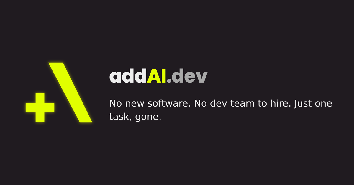
<meta property="og:image" content="https://addai.dev/assets/og-image.png">
<meta name="twitter:card" content="summary_large_image">One that doesn't split cleanly
Compressed images doesn't sort neatly into "there" or "missing." Most of what the site serves is a reasonable size for what it is: the Open Graph card above is a correctly-sized 1200x630 at 68KB. The homepage logo isn't: a 1024x1024 PNG displayed at 56px, more resolution than the display needs. Not broken, nothing renders wrong, just not resized for the web yet. We checked rather than assumed, and we're naming it instead of letting it quietly drop off the list.
Still to sequence
The rest of the list isn't a technical fix, it's a set of real decisions: a real physical contact address, a privacy policy and terms and conditions worth actually reading, whether a cookie banner and analytics belong on a site this small at all, a sticky mobile CTA, a dedicated thank-you page instead of our current inline confirmation message. None of those are "we forgot" - they're "we haven't decided yet," and we're not going to fake a privacy policy or a business address just to check a box. When we do sequence them, it'll be with the same care we put into the two fixes above.
A checklist isn't a source of shame, it's a punch list. Fix what you can fix outright, say directly what still needs a real decision, and don't let "looks finished" stand in for "is finished."