# We Ran Our Own Site Through a Stranger's Checklist
*A 20-item website checklist went viral on X. We ran addAI.dev through it ourselves, fixed what we could fix outright, and are plain about the rest.*
addAI.dev · Field Notes
By [Jay](mailto:jay@addAI.dev) · September 2026
`#SmallBusiness` `#TechDeepDive`
[A post](https://x.com/Manixh02/status/2098985979067724192) went around recently with a simple, sharp premise:
> Your vibe coded website looks finished, But It's not.
Twenty items followed, spanning technical, SEO, UX, legal, and performance basics. The closing line is the whole pitch: *"Pretty is easy. This list is what actually ships."* It's picked up over 260,000 views at the time we're writing this, and it's easy to see why: it's aimed squarely at the gap between a site that looks done and a site that actually is.
That gap matters just as much when the reader is a crawler or an agent, not only a person, which is part of why we hold our own site to the same bar we'd hold a client to: we ran our own site through the list, **for real, not cherry-picked**.
## The list
- Custom 404 page
- Meta title on every page
- Meta description on every page
- CTA above the fold
- Favicon set
- robots.txt file
- sitemap.xml
- Open Graph image
- Alt text on every image
- Mobile breakpoints
- Sticky mobile CTA
- Loading states
- Form error states
- Thank you page
- Privacy policy page
- Terms and conditions
- Cookie banner
- Analytics installed
- Real contact address
- Compressed images
## Already there
Most of the technical and SEO items were already covered on their own merits: a meta title and description on every page, a favicon set, alt text on every image, a CTA above the fold on the homepage. Two of them, `robots.txt` and `sitemap.xml`, also came up in the deeper technical dive in [How to Make Your Website Visible to AI](/blog/how-to-make-your-website-visible-to-ai.html). Mobile breakpoints get a real nuance instead of a flat yes: no literal `@media` width-breakpoint queries, but a fluid layout, flexbox and `clamp()` sizing instead of fixed breakpoints, covering the same ground a different way. Two more are worth **pointing at directly**, because "we have this" is easy to say and we'd rather show it.
Loading states, real code, not a claim:
```
status.textContent = "Sending…";
status.className = "form-status";
button.disabled = true;
```
*assets/form.js*
Form error states are the same file, a few lines down: a failed submission gets its own message and re-enables the button, rather than leaving a visitor staring at a form that silently did nothing.
## Fixed today
Two items were **genuinely missing**, and neither needed anything beyond our own judgment to fix, so we just built them rather than filing them away.
A custom 404, on-brand instead of Cloudflare's default:
```
This page went missing.
No agent, crawler, or human is going to find it at this address. Let's get you back on track.
```
*404.html*
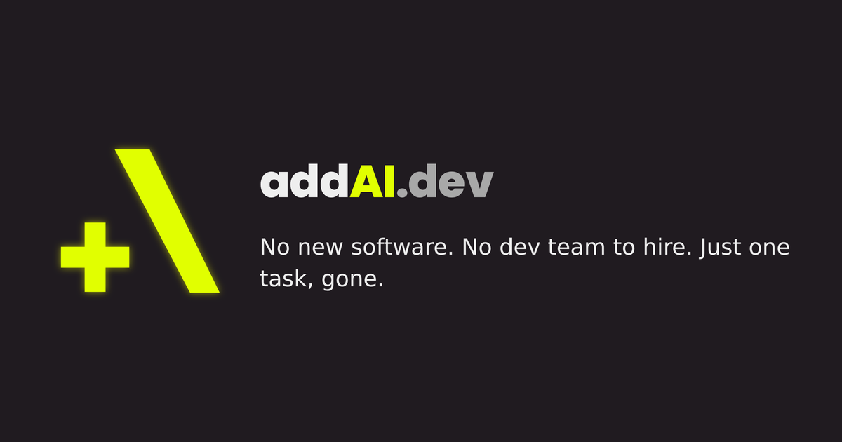
And an Open Graph image, so a link to this site actually looks like something when it's shared, instead of a bare title on a white card:
*assets/og-image.png*
```
```
*every page's \*
## One that doesn't split cleanly
Compressed images doesn't sort neatly into "there" or "missing." Most of what the site serves is a reasonable size for what it is: the Open Graph card above is a correctly-sized 1200x630 at 68KB. The homepage logo isn't: a 1024x1024 PNG displayed at 56px, **more resolution than the display needs**. Not broken, nothing renders wrong, just not resized for the web yet. We checked rather than assumed, and we're naming it instead of letting it quietly drop off the list.
## Still to sequence
The rest of the list isn't a technical fix, it's a set of real decisions: a real physical contact address, a privacy policy and terms and conditions worth actually reading, whether a cookie banner and analytics belong on a site this small at all, a sticky mobile CTA, a dedicated thank-you page instead of our current inline confirmation message.
> None of those are "we forgot." They're "we haven't decided yet."
And **we're not going to fake** a privacy policy or a business address just to check a box. When we do sequence them, it'll be with the same care we put into the two fixes above.
A checklist isn't a source of shame, it's a punch list. **Fix what you can fix outright**, say directly what still needs a real decision, and don't let "looks finished" stand in for "is finished."
[Get in touch](/contact.html)